My goal here was to simplify a broad topic into small but memorable chunks. I used AI as an ideation tool to come up with this topic because I did not have any strong personal scientific interests that I thought could be made into an infographic. The only information it helped me with was the overall topic and recommendations for sources to use. I used Adobe Illustrator to create the graphic.
This was really my first shot at attempting visual scientific storytelling, so I figured it was best to follow the advice of Kwan-Liu Ma, author of Scientific Storytelling using Visualization. Lui-Ma writes, that good stories involve several important features and “Finally, they leave a lasting impression, either by piquing the audience’s curiosity and making them want to learn more.” What I attempt to do is breakdown several key components and coordinate their colors to create an association with a new topic.
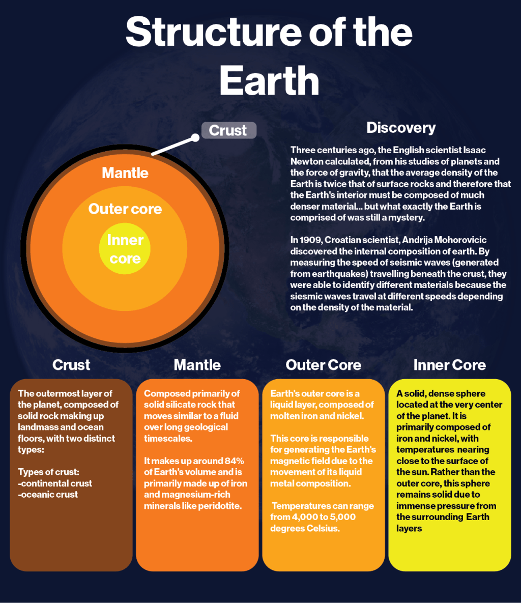
Authors of Improving Visual Communication of Science Through the Incorporation of Graphic Design Theories and Practices Into Science Communication write, “visual material is typically treated as an add-on instead of being an integrated part of the whole.” For this visual, I see it as an introductory resource. I would say it needs another diagram or two if it was a standalone graphic. I describe very basic details of history and breakdown the scientific details into concise categories.
The Art & Design Foundation claims, “Overlap is the placement of one shape in front of another to create the illusion of depth.” To create an element of depth I used an opaque image of the earth and blended it in with the larger background color. This created a level of texture that made the information pop out more than if I chose a simple background.
