• About
    • All posts

Getting to Know Stolen Focus

  • The Relationship Between Visualization and Writing

    November 4th, 2024

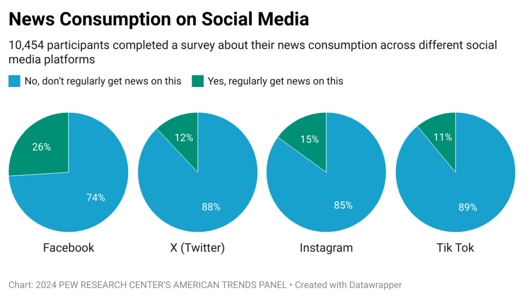
    In the same way that familiar writing styles have identifiable design properties like format and punctuation that make the information easier to comprehend, visual design does too. In fact, according to The History of Visual Communication, “Writing is the essence of visual communication and by extension of visual communication design.” The origins of visualization come from the written word, therefore the fundamentals of writing are the fundamentals of visualization. Visualization can create powerful experiences for the viewer that are not possible through the sole use of text. By taking a look at a range of paintings, photographs, and diagrams, the relationship between the written word and visualization becomes more clear.

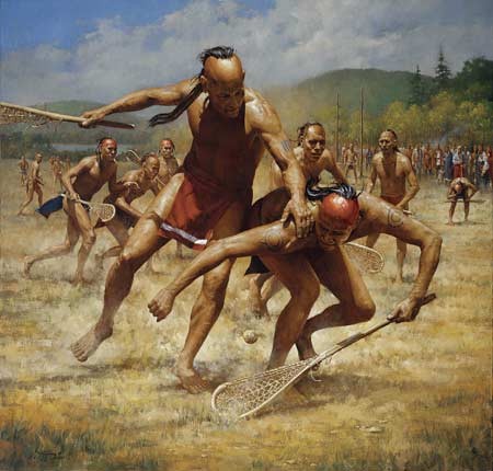
    This is perhaps the most famous depiction of lacrosse we have to this day. Lacrosse, now played with a much different set of rules, was invented by Native Americans, and the first records of the sport come from the 1630s. This image depicts a battle between two players to pick up the ball. The ball blends into the environment because it is not a major focus of the painting. The focus is competition between two players. You can tell there are levels of passion and desire because of how low the player on the right it and because the player on the left is trying to hold him back. Behind them, you can see others competing with each other, a crowd, some players gasping for air, and a large wide field. This tell us that the game is strenuous and also important to the community.

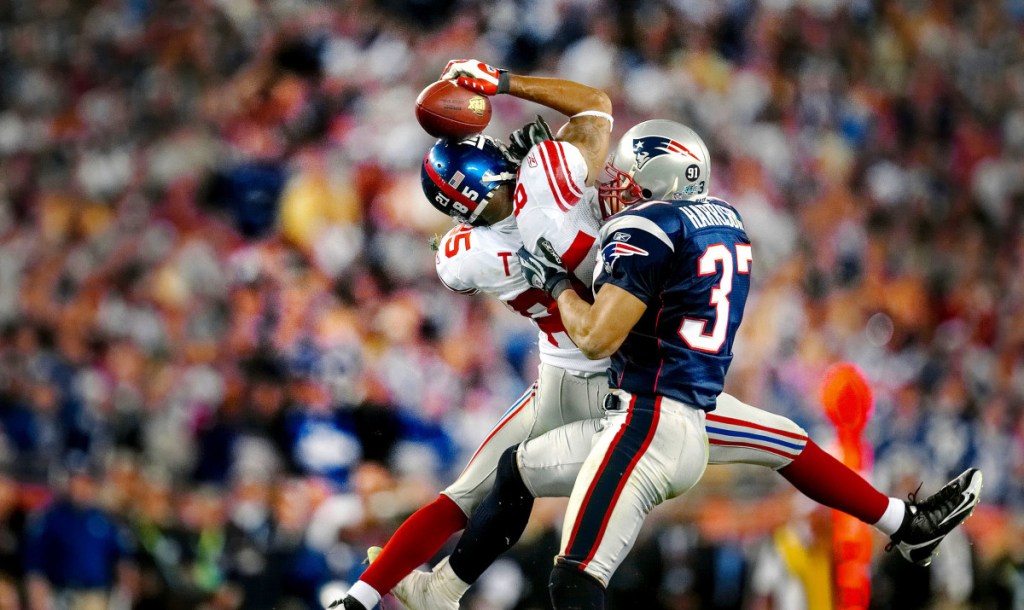
    The helmet catch. This is one of the most famous plays in American sports history. In the Super Bowl, during a last-ditch effort to tie the game, an extremely improbable play happened. David Tyree used one hand to catch the ball by pinning it on his helmet. Even with defenders trying to rip the ball away, he still had the strength to secure the catch. You cannot even see Tyree’s left arm in the play. Not only that, this miraculous play was completed in the air. Tyree’s feet are completely off the ground. While describing the complexity of this catch through language could be effective, what is better to represent it than itself?

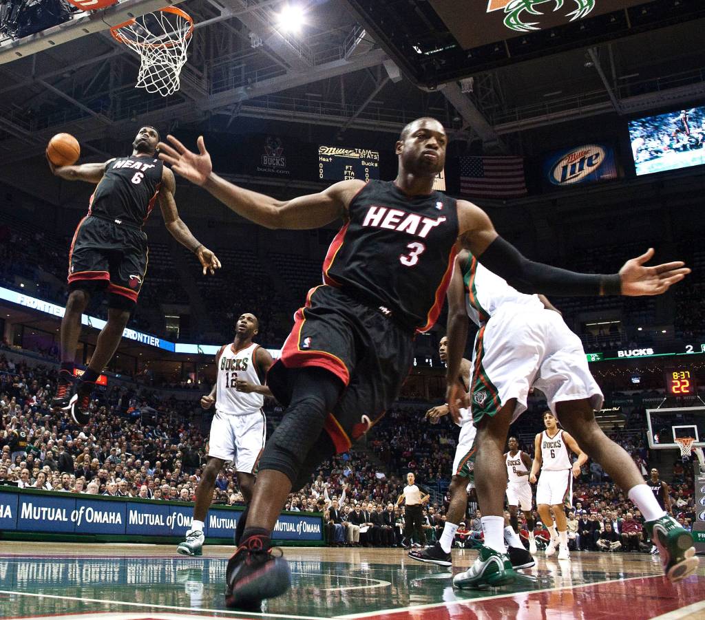
    This is a depiction of ultimate teamwork and chemistry. What cannot be seen is that the player in front passed the ball behind him in the air for his teammate to grab it. What is seen in the picture is high levels of trust and confidence that the teammate will complete the play. Also, by raising his arms up to the side, the player communicates that he is aware mid-play that he is completing a miraculous play.

    I wanted to include some photography of a primary source because it profoundly impacts storytelling. The experience of reading text that describes a historical event compared to directly seeing how it was described by those who were there to experience it is vastly different. There is a time and place for both when telling narratives, but the opportunity to include direct visual sources from history will strengthen the reader’s understanding of the story.

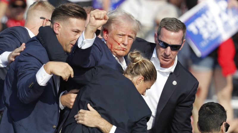
    The last thing I want to do is to provide commentary on anything Trump…but that image will undoubtedly go down as one of the most incredible in American history. Yes, this image represents an attempted assassination of the President. However, that is not the significance of the image I am focussed on. I want to make an example of this image because it not only represents everything it directly depicts, but it is also representative of a period in American history. It captures the varying attitudes of a culture and country. This image doesn’t tell the story of one man, it tells the story of millions.

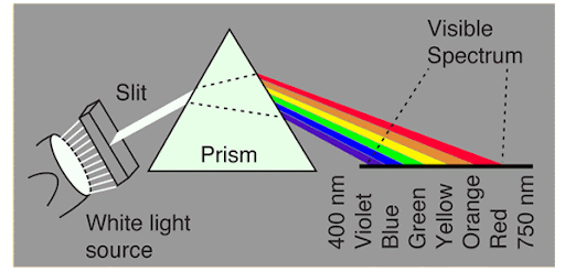
    Using a diagram within narratives can be extremely helpful in communicating complex information or something that is challenging to visualize. Personally, without this visualization, understanding how a prism works would be hard for me. Simultaneously, this visualization on its own does not do the trick either. For example, without text describing how the light bends, I would not be able to comprehend that either. As a creator, identifying what information needs visualization and what needs description is an important skill.

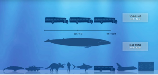
    There are certain things that humans are innately challenged by when it comes to comprehension. Once things pass a certain threshold, using a scale to make the information more digestible is helpful. Particularly distance and size can be a challenge. By comparing objects that are common and easy to comprehend, a deeper understanding can be gained, and thus, the narrative will have a stronger impact on the reader.

  • October 11th, 2024

    Companies collect a lot of data about their customers and how they use their products. This information can be helpful and provide powerful insights. However, oftentimes, the data lacks the contextual support that helps organizations truly understand the importance and significance of their customers’ experiences. 

    Journey mapping is a tool that can help designers understand their users on a deeper level by using limited resources. UX expert Paul Boag writes, “Data often fails to communicate the frustrations and experiences of customers. A story can do that, and one of the best storytelling tools in business is the customer journey map.” Through the power of storytelling, deeper insights about previously collected data and even future research can be understood at a higher level. 

    A journey map details the user’s experience “from initial contact, through the process of engagement and into a long-term relationship.” By following this process, I was able to uncover details about the experience of buying a lacrosse stick that I was not aware of before. More importantly, it opened my eyes to many things I was already familiar with, but would not necessarily have considered an important aspect of the buying experience. 

    One of my favorite aspects of journey mapping is the power that personas have. They allow for a more seamless transition from a design perspective to a true user perspective. For example, my journey map detailed that talking about gear with friends was common for Mike. As a designer, imagining what it would be like to talk to other middle schoolers about gear would probably not be impactful. However, the creation of Mike allows for a deeper understanding of what that could mean. It’s much easier to imagine Mike waking up for school, taking the bus, and sitting at the lunch table, sharing what is ‘very big news’ for a middle schooler. 

    Insights & Takeaways:

    This can be a challenging product to sell at times, especially for young players. This is because of the added element of a parent in the journey. It is not only important to focus on the journey of the play but also the journey of the parent who has the purchasing power. 

    It would be a helpful product for individual companies or even a third-party service to provide a side-by-side product comparison. 

    Between coaches, teammates, friends, and even content creators, there is a high level of peer influence on this buying process. Depending on the specific case, this type of access to peers could lead to a seamless buying process or it could increase levels of confusion and pressure. By making sure there is clear and distinct messaging about the product, confusion can be avoided in many cases. 

    There is a desire for in-store experiences. Even if customers like Mike aren’t making purchases, being around the new equipment is exciting, and has the power to drive future purchases. 

    Below is a presentation that acts as the building blocks for the journey map:

    Journey MapDownload

  • Becoming a Systematic Designer

    October 9th, 2024

    Why use do we use ideation techniques?

    It is a challenge to combine high levels of creative solutions into a simple and clear product. Although these methodologies may seem trivial at times, the clarity of thought that they provide eases the challenge for designers of bridging the gap between creativity and simplicity.

    “Rather than waiting for “inspiration to strike,” UX designers need a systematic way to approach everyday design activities so that they produce high-quality designs and solve usability problems.”

    Aurora Harley, 2017
    Ideation TechniquesDownload

    The three applications we are examining are categorized as music streaming, gaming, and travel. Although there is a large range of what these apps are intended for, it serves as a positive example that ideation techniques have a strong impact on understanding regardless of the subject of the product.

    Ideation Techniques Applied:

    • Challenge Assumptions
    • Bodystorm
    • Analogies
    • Worst Idea Possible

    This process is all about gaining a new perspective through utilizing the POV statements and adding another level of depth to that perspective through ideation techniques. Thus, increasing our ability to find new solutions or approaches for the design of the product.

    Insights & Perspectives Gained:

    Soundcloud: 

    Can consider adding an element of personalized search based on listening history. Rather than results being directly based on the language of search, perhaps something like genre-listening history can be an influence on search results. 

    Users with large music libraries are seeking alternate organization methods for their music outside of their playlists and ‘liked’ music. A counter-argument to this could be that due to disorganization users listen to a wider range of artists and it also leads to longer time spent within the application. 

    Clash of Clans:

    The length of commitment to this game is a pain point for some players. Rather than feeling like an ‘achievement’ by collecting enough resources for an upgrade, players get frustrated by having to wait for upgrades to be complete. 

    This game has a unique relationship with time. It is designed for years and years of play while some users may be used to games that involve quick successes. Those who enjoy this game and value it most have to ability to play it in a more passive manner which would make their passion appear to not be aligned with their play-time. 

    It is essential for player happiness and enjoyment that the playing field is even for paying and non-paying players. Paying players certainly should have access to more exciting features in the game. However, this should never involve giving them an advantage in player-to-player interactions. 

    Airbnb: 

    Through reading the customer reviews, it became clear that the largest pain point for airbnb customers is the customer service they receive. Based on their experiences, there appears to be a lack of speed and seriousness taken by the customer service team. I think some of this stems from users not fully understanding the product and the role of importance for hosts. In a lot of cases, airbnb is not in a position to provide assistance because the hosts assume a lot of responsibility.

    The hosts themselves desire more freedom to market their properties the way they see most fit. They have deeper insights into the value of their properties. In a similar vein, guests who have already experienced the property have insights into the value of the property. Perhaps giving some more influence to both hosts and guests on how the properties are displayed will lead to more rentals.

  • User Experiences Across Music, Gaming, and Travel Applications

    October 3rd, 2024
    App POVsDownload

    As designers, one of the most valuable resources, if not the most valuable, is the customer. I’ve never been one that subscribes to the mantra that ‘the customer is always right’, but in the case of UX, they truly can never be wrong. The customer’s only responsibility is to use the product the best way they know how. Each individual has different capabilities and intentions for the product, so there will be a range in how customers are using the product AND how they react to the product. 

    At a young age, I have one particularly memorable experience with user interfaces. I remember in my later elementary school years, my family switched from a Windows desktop to an Apple desktop. Whether it was my young age or inexperience with computers, I remember being strongly frustrated trying to close and minimize internet pages. Apple has since updated the ‘close’, ‘minimize’, and ‘full screen’ buttons to be color red, yellow, and green to make it more intuitive. I like this example because it highlights that something very simple and seemingly intuitive can still be a pain point for someone else. 

    I examined a range of applications including music, gaming, and travel. Across these apps, there were a lot of similarities regarding the nature of the complaints. What was most frustrating for users was when the application was not working as they expected it to. This most commonly followed updates to the application that had bugs or led to connectivity issues and prevented users from their normal use habits. 

    For music, the reviews made it clear that for a lot users, music is central to their daily experience, so having consistency in their experience is crucial. Additionally, a lot of users use multiple platforms, so if one is lacking in what another is proficient in, the experience will be more agonizing.

    For gaming, the reviews made it clear that the users highly value a ‘fair’ game. Generally,  adding paid options or new elements to the game creates new imbalances within the gameplay or at the bare minimum creates strategy changes which is uncomfortable for users.

    For traveling, the reviews made it clear that customer service is a top priority. This makes a lot of sense based on the nature and design of the app. For the app to be effective, users and property owners must be organized and complete real-world actions. Naturally, for any number of reasons, some of the real-world actions aren’t completed in a timely manner. That coupled with actual design issues within the app means that they have to have a high level of customer service to help troubleshoot any problems. 

  • Soundcloud Personas

    September 26th, 2024

    “The Initial Mystery that attends any journey is: how did the traveler reach his starting point in the first place?”

    -Louise Bogan (American Poet)

    The reason why I love this quote is because it makes you strongly aware of what you could not possibly know about your hero. As designers, as much energy as we dedicate todeeply and intently focussing on our users’ journey, there are still factors outside of the journey that will have profound impacts on the journey itself. 

    UX PersonasDownload

    For the most part, uncovering the core of a user’s experience is impossible without them. However, this is a common position that designers will find themselves in. Whether it is no access to users, limited access, or you’ve never had users at all, strategies can be used to increase awareness and perspectives of the user experience. 

    Creating personas to better understand user experiences allows designers to reason endlessly with direction and specific reasoning. In comparrison designers can reason about their users in general, however, this methodology lacks direction and it is more challenging to identify specific influencers for users. User experience expert, Kevin O’Connor writes, “as the marketplace shifts from a mass manufacturing to a mass customization model, customers needs and desires are more accurately identified through the development of personas rather than through demographic data.” (UX Magazine). This article is from 2011 and it still holds true. It is as important as ever because now our youngest generations have been exposed to highly customized experiences through internet exposure their entire lives. 

    Through creating persona’s for different Souncloud users and myself (as a Soundcloud user), I was able to gain deeper insights to the user experience on their platform. One of the focusses while creating personas is the usability of the product. According to digital.gov, “Usability refers to the measurement of how easily a user can accomplish their goals when using a service.” Using our personas to more deeply understand this, we can see that usability will vary across users. For example, if one user is subrsribed to a premium version of soundcloud and has the application one their phone, following a shared link to a song would be as easy as clicking the link. The usability in this scenario is high. However, for a user that does not have an account or the application, they would have to jump through several hoops before they can hear the shared link. This could include things such as creating an account, remembering an old password, or downloading the app. With each one of these steps not only does the usability decrease but the user’s desire to use the service also decreases. By creating different personas with diverse backgrounds and motivations, it will help designers uncover new insights about their users and provide the necessary context that makes those insights meaningful

  • 3 Great Empathy Research Methods

    September 12th, 2024

    As well documented as the power of empathy is, the ability of people to execute and consistently practice empathy is a challenge. This goes for any avenue of life, but especially in professional settings. In the age of social media, consumers are much more used to products that are designed to take advantage of our humanness rather than products designed with our wants, needs, and experiences in mind. 

    To execute empathy in product design, a large amount of focus and detail has to go into the whole process. It starts with implementing empathy into research methods. According to Ale Wiecek, an empathy expert, the goal of empathetic research methods is “to gather enough information on the problems they are exploring, before making assumptions. It reinforces the importance of understanding a problem or experience from the customer/user’s perspective, rather than our own.” For designers, aligning your own understanding of the problem you are seeking to solve from the perspective of others and without assumption leads to great solutions

    Empathy Research Methods

    Personas:

    This is a great methodology for a starting place or if designers do not have direct access to customers. A persona is a fictional character that is created to represent the different types of consumers who may use a particular product. Psychologist Jonathan Gruden on why personas are effective writes, “Data from psychological studies and artistic experience indicate that one naturally and generatively creates and engages with detailed representations of people. Personas bind into this powerful human capability. Most of the people do not naturally reason about extensive statistical summaries, but they do reason effortlessly about people, real or fictional.” (researchgate). It is critical that the personas are based on research for the design, however, outside of that, the development of these personas are up to the intuition of the designers. According to the Interaction Design Foundations, personas “make the design task at hand less complex, they will guide your ideation processes, and they will help you to achieve the goal of creating a good user experience for your target user group.” Although this isn’t necessarily as valuable as working directly with a customer, it requires very little resources, and still can provide strong insights. 

    Journey Mapping:

    According to Harry Brignull, “journey mapping is a way to deconstruct a user’s experience with a product or service.” (marvel app) This method is all about getting a detailed firsthand customer experience. Through this experience, designers can more easily identify pain points, validate assumptions about the customer or their experience, and predict future opportunities to improve the design. Typically, a journey map is recorded on a table. The horizontal axis will detail the experience through time. For example, if the product was soda, the horizontal axis would include everything from purchasing the soda, to how it opens, tasting it, and disposing of it. The vertical axis details analysis themes designers want to focus on. For example, these categories could be actions, questions, opportunities, pain points, enjoyable moments, etc. 

    Love Letter/Breakup:

    This is a great methodology to uncover the deep reasons why people connect or don’t connect with your design. This can be done by designers, stakeholders, or the customers themselves. It is a personal letter written directly to the product. Taking the time to reflect, write, and personify the product, can lead the writer the discover new things about their relationship with the product and reinforce what they already knew. 

    Through implementing these empathy centric research methods, designers can help ensure that they are creating a product that is focused on directly addressing the needs, wants, and desires of customers.

  • The Power of Design Thinking

    September 6th, 2024

    For those new to design thinking, it may surprise you how simple yet impactful this methodology truly is. Design thinking gets its value from its focus on innovation, collaboration, and user-centric solutions. According to experts at Fast Company, “Design thinking describes a repeatable process employing unique and creative techniques which yield guaranteed results — usually results that exceed initial expectations.” This process follows 5 steps that act as a roadmap for whatever type of problem-solving is occurring. Going into this, it is important to understand how much of an impact how you design has on what you design. Fast Company writes, “Although Design is most often used to describe an object or end result, Design in its most effective form is a process, an action, a verb not a noun.” Fast Company

    The 5 Steps of Design Thinking

    Empathize: At the beginning, the focus is on understanding the user’s needs, emotions, and experiences by observing or asking questions. This deepens the designer’s insight into the problem from the user’s perspective rather than relying on their own intuition. According to the Interaction Design Foundation, “The main aim of the Empathize stage is to develop the best possible understanding of your users, their needs and the problems that underlie the development of the product or service you want to create.” In other words, this is a time for research, reflection, and adding understanding many perspectives as possible with the time given.

    Define: The information gathered during the empathy phase is used to discover/articulate the core problem that the design will solve. This will be called the ‘problem statement’. This stage sets the foundation for the product to come to life. 

    Ideate: Using the knowledge and perspectives gained from the empathize and define steps, possible solutions to the problem statement are brainstormed. It is important to cast a wide net of solutions during this process. It is important to record every idea, so the best elements can be incorporated into the next step.

    Prototype: The best ideas are taken from the ideate period and put in place to create a solution to the problem statement. The concept here is that it is much easier to develop a product that is in a testable state. Prototypes should be low-cost and act as a facade to the real product. It should be the goal to make the prototype as real as possible without sacrificing a large amount of time. 

    Test: Prototypes are tested with users to gain feedback and insights. This will not only help refine the product but help ensure that it addresses the problem it is aiming to solve. Although the prototype may be developed in a short period, the users’ experience with the prototype should be taken very seriously and inform further testing.

  • What’s Important When Writing Data Narratives

    August 21st, 2024

    Crafting a narrative with a focus on data can be a very impactful form of storytelling. The ability to present data that resonates with an audience can significantly change the way a reader interprets a narrative. By weaving data into a story, complex information can become more relatable, memorable, and or impactful. 

    Define Your Narrative

    Readers are more likely to stay engaged if they understand what the aim of the article is. As a writer, before even gathering your data, you need to define a clear purpose or goal for your data narrative. 

    Know Your Audience

    As in all forms of writing, understanding your audience is critical to communicating a clear message. Who is your audience and what matters to them?

    What is different about this form of writing is the inclusion of data. When writing you always want to make sure to appeal to the audience’s knowledge level, and it is no different when creating data visuals. What information is critical for them to understand before interpreting the visual? And what about the data supports my narrative?

    Use data as evidence to back up the points you’re making. The numbers should serve to enhance your narrative, not overwhelm it. In an article, visuals designed for Wall Street traders should look different from the ones designed for Disney fans. Yet, the importance of those visuals can be equally as important to the overall message of the story. 

    Visualization

    In a world with so much misinformation, as ethical writers we have a responsibility to not mislead our audience. According to Edward Tufte author of Beautiful Evidence, “When we reason about quantitative evidence, certain methods for displaying, and analyzing data are better than others. Superior methods are more likely to produce truthful, credible, and precise findings.” In this piece, Tufte details two examples of real-world consequences as a direct result of visualization. 

    When writing, choose charts or graphs that best represent your data. They should be clean, simple, and easy to interpret. Well-designed visuals can help your audience grasp your message quickly and remember it longer which will improve the overall impact of your narrative.

  • Experimenting With Data Maps

    August 5th, 2024

    Today, we will be exploring three different map types based on three different datasets:

    -Choropleth Map

    -Symbol Map

    -Locator Map

    (links at the bottom of each figure redirect to an interactive version of the data)

    Choropleth Map & Drinking Water

    Last week I began investigating drinking water in the United States. The bar graph below represents those findings. I cross referenced a UNICEF data on drinking water and the US Census, to find the population totals. In the US, from 2009-2022, the number of Americans not using safely managed drinking water services was almost cut in half from ~14 million people to ~8 million people. These findings incited a more global curiosity regarding access to safe drinking water.

    The choropleth map below can help us visualize a global perspective pertaining to access to safely managed drinking water. It was my goal to create a map that displayed the percentage of the population with access to safe water services over a 10-year period however, that wasn’t possible on Datawrapper’s platform. If viewers zoom in using the map feature, they will be able to view the data if smaller countries. Unfortunately, there wasn’t data on enough counties to paint a full picture. However, as is, the map makes it easy to see what countries are outperforming others and trends by continent or region.

    https://www.datawrapper.de/_/1Qndp/?v=4

    Symbol Map & Football

    The next set of data I investigated was from my alma mater Muhlenberg College. Typically the football program performs well each year, and 2023 was no different. It was my goal to dig deeper into the relationship between in game performance (win/loss, point differential, and point total) and distance travelled for each match. For the graph below I would recommend traveling to the interactive version here: https://www.datawrapper.de/_/ukK2I/?v=2

    I selected a symbol map because I wanted to display an element of competition within the map. Each circle is sized based upon the point differential of each game. This was calculated by subtracting the opponent’s score from Muhlenberg’s. Based on the map, it appears that the closer to a major city the game is played, the larger to point differential is. I would’ve liked for an interactive element of this map to be the score differential displaying when users hover over the circles, however, I was unable to achieve that.

    https://www.datawrapper.de/_/Mb1Nx/

    Locator Map

    Next up for different map types is the locator map. These maps are most useful when the specific location is the primary data point. For this I used data I’ve been collecting myself over many years. Every time I go to a new pizza location and eat a plain pie that’s fresh out of the over I give it a score out of 10 and record the score and location on my phone. This map type is optimal for this data because the location’s are the most important piece of data. If I were to write an article about my pizza scoring, I would absolutely include an interactive map of all of the different locations because it will provide the readers with a detailed context of what the individual locations are.

    https://www.datawrapper.de/_/Jw545/

    Bonus

    Unfortunately one of the datasets I collected last week didn’t translate well to my mapping experiments. However, I still wanted to share the findings below.

    Extra Data & Experimentation w/ Datawrapper

  • Dear Data #1

    July 29th, 2024
    Dear Data #1Download

    It was my goal in this data visualization exercise to not only capture the chaos of the music industry, but the chaos within my mind when it comes to music. The reason for the circle and connected representation of my “liked music” is because that is the first point I allow a song to have a little home inside of my head. Not every song is equal and not every song can be impactful in any environment. There are some select songs, that no matter what when I listen to, it changes my mood. I wanted to represent that emotion in the data because it is an important step of understanding the song and knowing where/when/why it could be mixed while DJing.

←Previous Page
1 2 3 4 5 6
Next Page→

Blog at WordPress.com.


Loading Comments...
 

    • Subscribe Subscribed
      • Getting to Know Stolen Focus
      • Already have a WordPress.com account? Log in now.
      • Getting to Know Stolen Focus
      • Subscribe Subscribed
      • Sign up
      • Log in
      • Report this content
      • View site in Reader
      • Manage subscriptions
      • Collapse this bar