
The following article is based on a UX report of the TAPinto website (attached below)
For this project, I selected a local news provider to investigate their product and see how it can be improved. The reason why I wanted to examine a local news provider is because of their importance to democracy and the simultaneous national decline in local news businesses. Does this combination reveal that users no longer value local news or that the current platforms do not meet their needs? Let’s find out the truth about TAPinto!
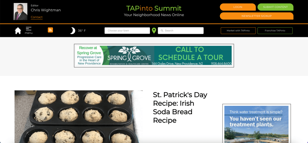
This is what users see on the homepage of the website
It doesn’t take an expert to realize that TAPinto’s site design is outdated. Everything from the color scheme, to the logo design, to website navigation, and more appears to have gotten left in the past. As important as every design choice is, with the decline of local news, calling the overall product into question in conjunction with design principles was an essential part of the piece for understanding how to best improve this website.
Here is a list of the methodologies used to research and investigate the TAPinto platform:
- Competitor Analysis
- Personas and Scenarios
- Interview Study (Proposal)
- Survey Study (Proposal)
- Card Sorting Study
- Diary Study (Proposal)
- Heuristic Evaluation
- Usability Testing Sessions and Analysis
Each methodology is different and provides a new perspective, but at its core, creates a framework to systematically empathize with users. When it comes to creating a product, you can never fully understand each individual’s experience, however, through utilizing UX research methods we can systematically collect data about users to ensure that design decisions support their goals.
The most valuable data and analysis came from stage 8 of the research, usability testing. For this method, three participants were asked to complete tasks on the TAPinto website. All of the participants had similar internet experience, yet because of the website’s design, they completed the tasks through different means. While this may be looked at as a positive because they were able to complete the tasks, their completion times varied, and exposed that the volume of options to navigate to specific points was too high. The number one priority for redesigning the website should be reducing the number of article topic from 22 to 10 or lower. Not only will this make the website design cleaner and more intuitive, topics will appear to be more constantly covered. As it currently stands, with 22 article categories, each section looks as if there’s little activity occurring when that is not the case.
The other primary changes that the methodologies support are:
-Redesigning the ‘Events’ page to have higher levels of readability and more clarity on what the events actually are.
-Redesigning the ‘Read More Articles’ button, so that users can more easily locate it and see more articles within the website.
-Select a more modern color scheme
-Curate the homepage articles to appeal to broader user interest
-Increase the emphasis on selecting relevant and enticing thumbnails for all articles, especially those under the ‘Government’ category.
Overall, by compiling these methodologies, we enable designers to increase the amount of input to create higher levels of clarity with their output (final design choices). The culmination of these methodologies helps us combine a variety of perspectives in a succinct manner that would not be possible without embracing the methodologies themselves. Whether the project is large or small, each person contributing will bring their own expectations and biasses with the design decisions they make. By incorporating data and research, we can increase the likelihood that designers are making decisions based on the same value system.
