Today, we will be exploring three different map types based on three different datasets:
-Choropleth Map
-Symbol Map
-Locator Map
(links at the bottom of each figure redirect to an interactive version of the data)
Choropleth Map & Drinking Water
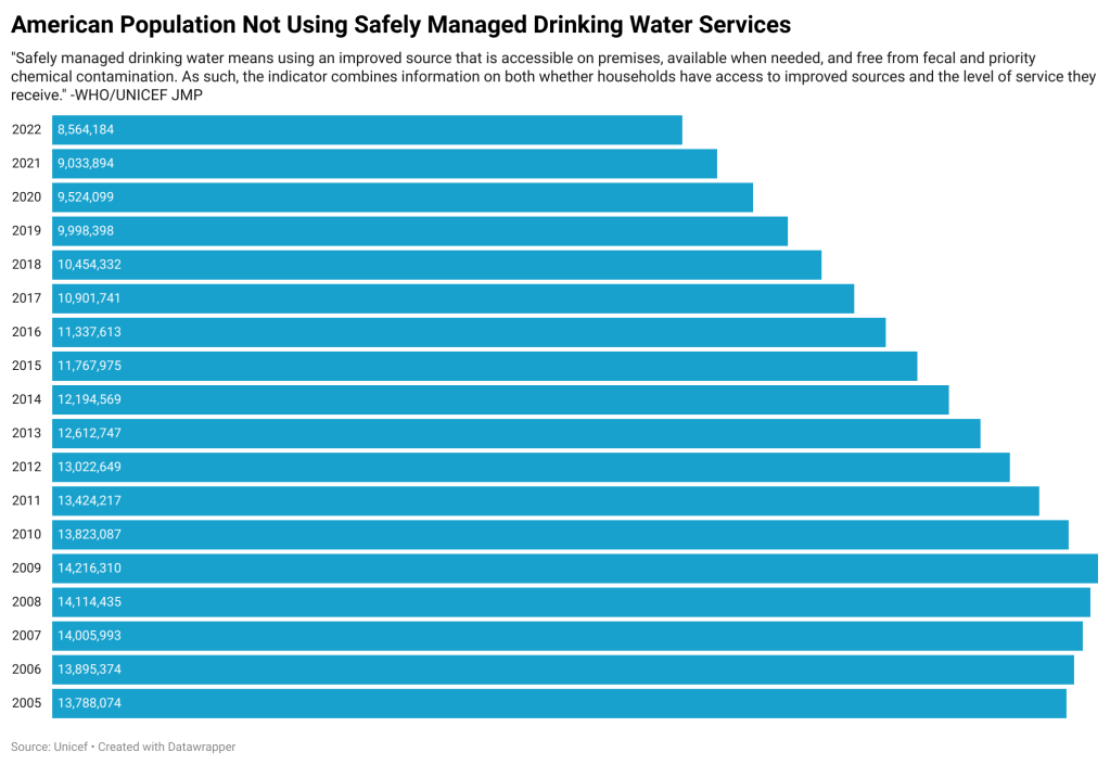
Last week I began investigating drinking water in the United States. The bar graph below represents those findings. I cross referenced a UNICEF data on drinking water and the US Census, to find the population totals. In the US, from 2009-2022, the number of Americans not using safely managed drinking water services was almost cut in half from ~14 million people to ~8 million people. These findings incited a more global curiosity regarding access to safe drinking water.
The choropleth map below can help us visualize a global perspective pertaining to access to safely managed drinking water. It was my goal to create a map that displayed the percentage of the population with access to safe water services over a 10-year period however, that wasn’t possible on Datawrapper’s platform. If viewers zoom in using the map feature, they will be able to view the data if smaller countries. Unfortunately, there wasn’t data on enough counties to paint a full picture. However, as is, the map makes it easy to see what countries are outperforming others and trends by continent or region.
Symbol Map & Football
The next set of data I investigated was from my alma mater Muhlenberg College. Typically the football program performs well each year, and 2023 was no different. It was my goal to dig deeper into the relationship between in game performance (win/loss, point differential, and point total) and distance travelled for each match. For the graph below I would recommend traveling to the interactive version here: https://www.datawrapper.de/_/ukK2I/?v=2

I selected a symbol map because I wanted to display an element of competition within the map. Each circle is sized based upon the point differential of each game. This was calculated by subtracting the opponent’s score from Muhlenberg’s. Based on the map, it appears that the closer to a major city the game is played, the larger to point differential is. I would’ve liked for an interactive element of this map to be the score differential displaying when users hover over the circles, however, I was unable to achieve that.
Locator Map
Next up for different map types is the locator map. These maps are most useful when the specific location is the primary data point. For this I used data I’ve been collecting myself over many years. Every time I go to a new pizza location and eat a plain pie that’s fresh out of the over I give it a score out of 10 and record the score and location on my phone. This map type is optimal for this data because the location’s are the most important piece of data. If I were to write an article about my pizza scoring, I would absolutely include an interactive map of all of the different locations because it will provide the readers with a detailed context of what the individual locations are.
Bonus
Unfortunately one of the datasets I collected last week didn’t translate well to my mapping experiments. However, I still wanted to share the findings below.
Extra Data & Experimentation w/ Datawrapper